Colour ContrastsThere are seven different kinds of contrasts.
1. Contrast of Hue 2. Light-Dark Contrast 3. Cold-Warm Contrast 4. Complementary Contrast 5. Simultaneous Contrast 6. Contrast of Saturation 7. Contrast of Extension
Contrast of Hue Contrast of Hue occurs when a hue or color is separated and outlined by black or white lines.
White lines weakens the 'strength' and appearance of the color. Furthermore, the colors around the white lines wold seem darker.
A black line strengthens the appearance of the color. Also, the colors around the black lines would seem lighter.
Light Dark Contrast Light dark contrast is contrast between light values and dark values.
Cold-Warm Contrast Cold-warm contrast refers to the contrast between cool and warm colors. Cools colors consist of blue, green and purple. Warm colors consist of red, orange and yellow.
Complimentary Contrast Complimentary Contrast refers to the contrast between complimentary (opposite) colors. Complimentary colors are those that are directly opposite to each other on the color wheel.
Simultaneous Contrast It is the contrast between two colors that are almost complimentary, but not exactly. It is contrast between a color and another color that is to the right of left of its compliment.
Satisfaction to the eye requires harmonic balance of the colors. If the colors of something you're looking at were not balanced, the eye would tinge colorless, gray, or pure colors with the compliment of the colors next to it. Therefore, the reality of the color is effect by it's surrounding color, and would appear that is has shifted towards it's surrounding color's compliment. In other words, a color would look different than what it really is. This effect gives a feeling of excitement and lively vibration of colors of changing intensities.
Contrast of Saturation The term refers to the contrast between pure intense colors and dull diluted or grayed colors. Dull colors would appear to be duller when it is placed next to pure intense colors, and pure intense colors would appear move vivid when it is next to a dull color.
Contrast of Extension Different amounts of one color are needed to blance another. The contrast of extension is used to refer to contrast between the proportion of one area of color to another.
The foundations of pre-20th-century color theory were built around "pure" or ideal colors, characterized by sensory experiences rather than attributes of the physical world. This has led to a number of inaccuracies in traditional color theory principles that are not always remedied in modern formulations.
The most important problem has been a confusion between the behavior of light mixtures, called additive colour, and the behavior of paint or ink or dye or pigment mixtures, called subtractive colour. This problem arises because the absorption of light by material substances follows different rules from the perception of light by the eye.
A second problem has been the failure to describe the very important effects of strong luminance (lightness) contrasts in the appearance of colors reflected from a surface (such as paints or inks) as opposed to colors of light; "colors" such as browns or ochres cannot appear in mixtures of light. Thus, a strong lightness contrast between a mid-valued yellow paint and a surrounding bright white makes the yellow appear to be green or brown, while a strong brightness contrast between a rainbow and the surrounding sky makes the yellow in a rainbow appear to be a fainter yellow, or white.
A third problem has been the tendency to describe color effects holistically or categorically, for example as a contrast between "yellow" and "blue" conceived as generic colors, when most color effects are due to contrasts on three relative attributes that define all colors:
lightness (light vs. dark, or white vs. black),
saturation (intense vs. dull), and
hue (e.g., red, orange, yellow, green, blue or purple).
Thus, the visual impact of "yellow" vs. "blue" hues in visual design depends on the relative lightness and intensity of the hues.
http://www.wikipedia.org/
colour mixing screens:
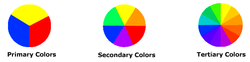
There are also definitions (or categories) of colors based on the color wheel. We begin with a 3-part color wheel.
Primary Colors: Red, yellow and blue In traditional color theory (used in paint and pigments), primary colors are the 3 pigment colors that can not be mixed or formed by any combination of other colors. All other colors are derived from these 3 hues.
Secondary Colors: Green, orange and purple These are the colors formed by mixing the primary colors.
Tertiary Colors: Yellow-orange, red-orange, red-purple, blue-purple, blue-green & yellow-green These are the colors formed by mixing a primary and a secondary color. That's why the hue is a two word name, such as blue-green, red-violet, and yellow-orange.