http://en.wikipedia.org/wiki/Josef_Müller-Brockmann
http://www.josef-muller-brockmann.net/
http://www.designishistory.com/1940/joseph-mueller-brockmann/
HERBERT BAYER:
Herbert Bayer (April 5, 1900 – September 30, 1985) was an Austrian American graphic designer, painter, photographer, sculptor, art director, environmental & interior designer, and architect, who was widely recognized as the last living member of the Bauhaus and was instrumental in the development of the Atlantic Richfield Company's corporate art collection until his death in 1985.
Bayer apprenticed under the artist Georg Schmidthammer in Linz. Leaving the workshop to study at the Darmstadt Artists' Colony, he became interested in Walter Gropius's Bauhaus manifesto. After Bayer had studied for four years at the Bauhaus under such teachers as Wassily Kandinsky, Paul Klee and László Moholy-Nagy, Gropius appointed Bayer director of printing and advertising.
In the spirit of reductive minimalism, Bayer developed a crisp visual style and adopted use of all-lowercase, sans serif typefaces for most Bauhaus publications. Bayer is one of several typographers of the period including Kurt Schwitters and Jan Tschichold who experimented with the creation of a simplified more phonetic-based alphabet. From 1925 to 1930 Bayer designed a geometric sans-serif Proposal for a Universal Typeface[1] that existed only as a design and was never actually cast into real type. These designs are now issued in digital form as Bayer Universal. The design also inspired ITC Bauhaus and Architype Bayer, which bears comparison with the stylistically related typeface Architype Schwitters.
http://en.wikipedia.org/wiki/Herbert_Bayer
http://www.designishistory.com/1920/herbert-bayer/
http://www.type.nu/bayer/
HARRY BECK:
Henry Charles Beck (4 June 1902 – 18 September 1974), known as Harry Beck, was an English engineering draftsman best known for creating the present London Underground Tube map in 1931. Beck drew up the diagram in his spare time while working as an engineering draftsman at the London Underground Signals Office. London Underground was initially sceptical of Beck's radical proposal — it was an uncommissioned spare-time project, and it was tentatively introduced to the public in a small pamphlet in 1933. It immediately became popular, and the Underground has used topological maps to illustrate the network ever since.
The striking Tube map that is recognised across the globe was the brainchild of Underground electrical draughtsman, Harry Beck, who produced this imaginative yet stunningly simple design back in 1933.
Beck based the map on the circuit diagrams he drew for his day job, stripping the sprawling Tube network down to basics.
The result was an instantly clear and comprehensible chart that would become an essential guide to London - and a template for transport maps the world over.
Beck's revolutionary design, with certain modifications and additions, survives to the present day and is set to serve London Underground and its millions of customers for many years to come.
MAX BURCHARTZ:
Max Hubert Innocenz Maria Burchartz (1887 – 1961) was a German photographer.
In 1922 Burchartz worked with Theo van Doesburg on a still-life course at the Bauhaus in Weimar, a break from his past work and turned him toward the 'modern trend', which was from then on expressed in a constructional style. While at the Bauhaus, he also worked as a translator.
http://en.wikipedia.org/wiki/Max_Burchartz
http://www.artcyclopedia.com/artists/burchartz_max.html
http://www.moma.org/collection/artist.php?artist_id=869
The multi-talented Max Burchartz was a member of the avant-garde group that criticised Bauhaus at a spectacular congress organised by the Constructivists and Dadaists in Weimar in 1922-23. Influenced by the Dutch De Stijl School, Burchartz turned away from expressionism and moved towards constructivism. He undertook another radical step when he gave up painting and dedicated himself to Neue Gestaltung in typography and advertising. In 1924, he founded the werbe-bau advertising agency in Bochum in the core region of industrial development.
Burchartz’s typophotos for the Bochum Association, colour coding system for the Hans Sachs Building in Gelsenkirchen, foundation courses at the Folkwang Academy in Essen, and many art theory and pedagogical texts are evidence of his work as a reformer. The photograph of his young daughter was taken in 1928. Called “Lotte (Auge)”, it became an icon of modern photography.
http://www.architecturebooks.eu/Max-Burchartz,-1887–1961-p-16520.html
POST MODERNIST:
JAMIE REID:
Jamie Reid (born 1947) is a British artist and anarchist with connections to the Situationists. His work, featuring letters cut from newspaper headlines in the style of a ransom note, came close to defining the image of punk rock, particularly in the UK. His best known works include the Sex Pistols album Never Mind the Bollocks, Here's the Sex Pistols and the singles "Anarchy in the UK", "God Save The Queen" (based on a Cecil Beaton photograph of Queen Elizabeth II, with an added safety pin through her nose and swastikas in her eyes, described by Sean O'Hagan of The Observer as "the single most iconic image of the punk era"), "Pretty Vacant" and "Holidays in the Sun".
Of course he is notorious for his work with the Sex Pistols in the mid to late-seventies, but there is so much more than this. His work with the Suburban Press was an early coalescing of his political drive and artistic 'nous' and work after the inmplosion of the Pistols extended his artistic drive through many genres - music, publishing, performance. His work is a spectrum with many unseen hues and it is our pleasure to journey through these works in presenting and safeguarding the Jamie Reid Archive. After a ten year installation period with the Strongroom Studios in Shoreditch he is now immersed in discovering and revealing the Aspects of the Eightfold Year." John Marchant
http://www.jamiereid.org/about/
Barbara Kruger (born January 26, 1945) is an American conceptual artist. Much of her work consists of black-and-white photographs overlaid with declarative captions—in white-on-red Futura Bold Oblique or Helvetica Ultra Condensed. The phrases in her works often include use of pronouns such as "you", "your", "I", "we", and "they". Kruger lives and works in Los Angeles and New York.
Barbara Kruger was born in Newark, New Jersey, in 1945. After attending Syracuse University, the School of Visual Arts, and studying art and design with Diane Arbus at Parson’s School of Design in New York, Kruger obtained a design job at Condé Nast Publications. Working for Mademoiselle Magazine, she was quickly promoted to head designer. Later, she worked as a graphic designer, art director, and picture editor in the art departments at House and Garden, Aperture, and other publications. This background in design is evident in the work for which she is now internationally renowned. She layers found photographs from existing sources with pithy and aggressive text that involves the viewer in the struggle for power and control that her captions speak to. In their trademark black letters against a slash of red background, some of her instantly recognizable slogans read “I shop therefore I am,” and “Your body is a battleground." Much of her text questions the viewer about feminism, classicism, consumerism, and individual autonomy and desire, although her black-and-white images are culled from the mainstream magazines that sell the very ideas she is disputing. As well as appearing in museums and galleries worldwide, Kruger’s work has appeared on billboards, buscards, posters, a public park, a train station platform in Strasbourg, France, and in other public commissions. She has taught at the California Institute of Art, The School of the Art Institute of Chicago, and theUniversity of California, Berkeley. She lives in New York and Los Angeles.
http://www.barbarakruger.com/
DAVID CARSON
(born September 8, 1954) is an American graphic designer. He is best known for his innovative magazine design, and use of experimental typography. He was the art director for the magazine Ray Gun. Carson was perhaps the most influential graphic designer of the 1990s. In particular, his widely imitated aesthetic defined the so-called "grunge typography" era.


David Carson was recently named one of the top five most influential designers by Graphic Design USA magazine. His work can be considered post-modern, and he largely influenced the dirty-grunge movement in design trends of the 90s. Carson started designing in the 80s with no formal schooling in the field and has since focused heavily on typography and photography. His work became well-known in the late 80s and early 90s through skateboarding and surfing magazines. Later, he started Ray Gun Magazine, a lifestyle and music magazine, and went on to start his own design firm, David Carson Design. Carson has written and co-authored a handful of books characterizing design trends. He continues to be active in the surfing community. Clients include Quiksilver, Suicide Girls, Samsung, Adidas, Nine Inch Nails, Pepsi, and Toyota.
David Carson’s design aesthetic is best seen through his works. His typographical treatments are first-rate, and he integrates photography to produce a minimal, low-fi look. In his recent work, David Carson has branched out into television and video as well, producing commercials, documentaries, short films, and more.
http://www.arsgrafik.com/david-carson/
JEFFERY KEEDY:
Born 1957, is an American graphic designer, type designer, writer and educator. He is notable as an essayist and contributor to books and periodicals on graphic design. He is also notable for the design of Keedy Sans, a typeface acquired in the permanent collection of the Museum of Modern Art in 2011.
A 1985 graduate of the Cranbrook Academy of Art, Keedy has been teaching design at the California Institute of the Arts (CalArts) since 1985. Keedy was also a frequent contributor to Emigre magazine throughout the twenty years of its publication. His designs and essays have been published in Eye, I.D., Emigre, Critique, Idea, Adbusters, Looking Closer One and Two, Faces on the Edge: Type in the Digital Age, New Design: Los Angeles and The Education of a Graphic Designer.
His typeface Keedy Sans, designed in 1989, is distributed through Emigre Fonts. He has also designed the Hard Times typeface which reassembles the elements of Times New Roman. In the mid 1980's he was a proponent of the view that design should be looked at as a cultural practice connected to themes of popular culture than a problem solving one.
http://www.emigre.com/Editorial.php?sect=1&id=20
ROSEMARIE TISSI
Information about the typeface designer Rosmarie Tissi and her fonts.
Rosmarie Tissi was born in Schaffhausen, Switzerland. After one year of preliminary courses at the School of applied art in Zürich, she had a 4-year apprenticeship in a graphic studio in Zurich.
Since 1968 she has shared a studio with Sigi Odermatt in Zurich.
In 1980 she designed 3 typefaces: Sonora, Mindanao, and Sinaloa.
Only Sinaloa is available worldwide. A typeface company in Zurich offered the two others.
Rosmarie Tissi, swiss designer, known for her popular typeface, Sinaola, succeeds at combining a rigid swiss style with playful and colorful experimentation. Rosemarie, has for most of her career, shared a studio with Siegfried Odermatt since 1968, as well as participating in AGI since 1974.
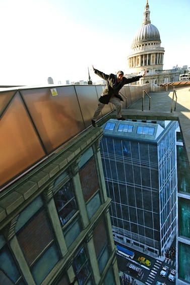
GRAFFITI AND STREET ART:
123KLAN:
123Klan is a French graffiti crew, founded in 1992 by husband and wife Scien and Klor. Since 1994 the crew have also worked in graphic design, inspired by the work of Neville Brody, and started to apply it to their graffiti (and vice versa). They describe their art as ‘when street knowledge meets technology and graffiti melds with graphic design’. Dean, Sper, Skam, Meric, and Reso 1 are the other crew members.
Now residing in Montréal, Canada - 123Klan's studio has found its niche specializing in character illustration, branding, toy design, and touring the world speaking at conferences. Their client list extends to the likes of Nike, Adidas, Lamborghini, Coca Cola, Stussy, Sony, Nasdaq to name a few.
'The great thing about graffiti is its impact on the streets. But most of people don’t like graffiti, simply because they don’t understand it. In a city you have probably less graffiti than advertising, and most of it is certainly uglier than certain graffiti pieces - so to come up with something that gets an impact on people in this visual jungle, it is a real challenge' - Scien
They have had exhibitions worldwide, including Lille, Dunkerque, Toulouse, Strasbourg, Paris, Brussels, London, Eindhoven, Roma, Munich, Barcelona, New York City, Singapore, and Zurich.
http://en.wikipedia.org/wiki/123Klan
http://www.123klan.com/
3D JOE & MAX
http://3djoeandmax.tumblr.com/
http://www.3djoeandmax.com/gallery
For the past seven years, pavement artists Joe Hill and Max Lowry have travelled the world from New York to Shanghai creating their unique 3D street art. They design their anamorphic paintings to encourage audience interaction. Their eye-catching creations are ideal for live events, marketing campaigns, music videos and TV commercials.
BANKSY:
Banksy is a pseudonymous England-based graffiti artist, political activist, film director, and painter.
His satirical street art and subversive epigrams combine irreverent dark humour with graffiti done in a distinctive stencilling technique. Such artistic works of political and social commentary have been featured on streets, walls, and bridges of cities throughout the world.
Banksy's work was born of the Bristol underground scene which involved collaborations between artists and musicians. According to author and graphic designer Tristan Manco and the book Home Sweet Home, Banksy "was born in 1974 and raised in Bristol, England. The son of a photocopier technician, he trained as a butcher but became involved in graffiti during the great Bristol aerosol boom of the late 1980s." Observers have noted that his style is similar to Blek le Rat, who began to work with stencils in 1981 in Paris, and members of the anarcho-punk band Crass, which maintained a graffiti stencil campaign on the London Tube System in the late 1970s and early 1980s. However Banksy himself stated on his website that in all actuality he based his work on that of 3D from Massive Attack, stating, "No, I copied 3D from Massive Attack. He can actually draw."
Known for his contempt for the government in labelling graffiti as vandalism, Banksy displays his art on public surfaces such as walls and even going as far as to build physical prop pieces. Banksy does not sell photos of street graffiti directly himself; however, art auctioneers have been known to attempt to sell his street art on location and leave the problem of its removal in the hands of the winning bidder. Banksy's first film, Exit Through the Gift Shop, billed as "the world's first street art disaster movie," made its debut at the 2010 Sundance Film Festival. The film was released in the UK on 5 March 2010. In January 2011, he was nominated for the Academy Award for Best Documentary for the film.
http://en.wikipedia.org/wiki/Banksy
http://www.banksy.co.uk/
YOk:
http://www.melbournegraffiti.com/melbourne-graffiti_interviews_yok.php
INTERVIEW:
Can you tell us a bit about your background?
I draw pictures of Gargoyles, most of my characters are based on gargoyles, I don't write anything just characters. I grew up in Perth and after a trip to London and Barcelona became interested in painting. Ayems taught me how.
How did you choose your tag, any special meaning?
Yok had no meaning so I wanted my work to give it a meaning. I've since found out it means to disagree in Turkey, and it's Jewish slang for an Aussie, and has something to do with food in Thai.
How did you get in to graffiti?
I loved seeing people's work popping up on the street so started trying out my own. And thanks to Ayems.
What is it that you love about graffiti that keeps you writing?
People experimenting doing new things, surprising you with a twist to their style and doing things they haven't tried before.
Tell us about your style and how it has developed over the years.
It's pretty Looney Tunes cartoon-like I guess, quite basic, bold, I try to keep the number of lines to a minimum, with a bit of an evil undertone.
Who have been your major influences?
Ayem crew
Paint brand of choice
Belton I guess, with a Dulux fill, Sabotaz has some different colours.
Cap of choice
NY/ Grey dot
What music motivates you to paint?
For some reason it always seams to be slow, down beat kinda stuff. I have been trying to listen to new music lately. I just won some CD's for drawing a picture of Chuck Norris, they are doing the job at the moment.
JR:
JR (born 22 February 1983) is the name of a photographer and artist whose identity is unconfirmed. He has described himself as a "photograffeur", he fly posts large black-and-white photographic images in public locations in a manner which is similar to the appropriation of the built environment by the graffiti artist. He states that the street is "the largest art gallery in the world." He started out on the streets of Paris. JR's work "often challenges widely held preconceptions and the reductive images propagated by advertising and the media."
JR's work combines art and action and deals with commitment, freedom, identity and limits. He has been introduced by Fabrice Bousteau as: "the one we already call the Cartier-Bresson of the 21st century". On 20 October 2010, JR won the TED Prize for 2011. "The TED Prize is awarded annually to an exceptional individual who receives $100,000 and, much more important, 'One Wish to Change the World.' Designed to leverage the TED community's exceptional array of talent and resources, the Prize leads to collaborative initiatives with far-reaching impact."
http://senseslost.com/2008/06/03/jr-graffiti-art/
FILM THEORY:
SAUL BASS:
(May 8, 1920 – April 25, 1996) was a graphic designer and filmmaker, perhaps best known for his design of film posters and motion picture title sequences.
During his 40-year career Bass worked for some of Hollywood's greatest filmmakers, including Alfred Hitchcock, Otto Preminger, Billy Wilder, Stanley Kubrick and Martin Scorsese. Amongst his most famous title sequences are the animated paper cut-out of a heroin addict's arm for Preminger's The Man with the Golden Arm, the credits racing up and down what eventually becomes a high-angle shot of the United Nations building in Hitchcock's North by Northwest, and the disjointed text that races together and apart in Psycho.
Bass designed some of the most iconic corporate logos in North America, including the AT&T "bell" logo in 1969, as well as AT&T's "globe" logo in 1983 after the breakup of the Bell System. He also designed Continental Airlines' 1968 "jetstream" logo and United Airlines' 1974 "tulip" logo which became some of the most recognized airline industry logos of the era.
http://designmuseum.org/design/saul-bass
The movie’s theme was the struggle of its hero - a jazz musician played by Frank Sinatra - to overcome his heroin addiction. Designed by the graphic designer Saul Bass the titles featured an animated black paper-cut-out of a heroin addict’s arm. Knowing that the arm was a powerful image of addiction, Bass had chosen it – rather than Frank Sinatra’s famous face - as the symbol of both the movie’s titles and its promotional poster.
That cut-out arm caused a sensation and Saul Bass reinvented the movie title as an art form. By the end of his life, he had created over 50 title sequences for Preminger, Alfred Hitchcock, Stanley Kubrick, John Frankenheimer and Martin Scorsese. Although he later claimed that he found the Man with the Golden Arm sequence "a little disappointing now, because it was so imitated".
LA BOCA:
http://site.laboca.co.uk/
Established in 2002, La Boca is an award-winning, independent design studio
specialising in illustration and image-making. We strive to create emotional
connections through our work and value any small part we can play in contributing
to popular culture as a whole.
We've worked with a wide spectrum of international clients, on projects ranging from
limited edition vinyl record sleeves through to full-scale campaigns that touch
just about every type of media.
Our images have featured in publications and exhibitions world-wide, and we have
been fortunate to receive recognition from a number of prestigious design awards.We are based in Portobello, West London, and we still enjoy fruit.
http://site.laboca.co.uk/About
YANNIS NAAMANE:
I’m a french graphic designer and illustrator based in Strasbourg France. I love cinema, video games and music so my work is very influenced by these universe. I try to diversify my work, but my projects are often in a minimalist style influenced by Saul Bass and other graphic designer. I mix design elements from different worlds to achievesomething original and representing me. I create just what I like.
HTTP://WWW.BEHANCE.NET/YANNISNAAMANE
DANIEL ZENDER:
Describe your work in 10 words or less.
My collage work is: surreal, colorful, spontaneous, fun, stimulating, weird, um....
What do you like to work with (magazines, photographs, vintage)? Be specific!
I find photographs, and use the blocks of colors in the backgrounds of them for the majority of my work. Sometimes I use construction paper or halftone textures from photocopies, and recently letraset typography for some poster work.
How long have you been creating collages and what made you start?
Not until very recently did I start dabbling in collages. I was looking for a way to play outside of my conceptual, client based design and illustration work.


Are you solely an artist, or do you work in another profession?
I also teach a design class at Missouri State University and work at a coffeehouse occasionally.
Do you have any formal art training?
I have my BFA from MSU.
Explain your favourite techniques.
Sketching, then silkscreen, cutting and pasting, inking, and experimenting always.
Describe your favourite piece ever created.
The one that comes to mind first is an image I made of Little Red Riding Hood, which I created first using cut paper, and colored digitally. It takes everyone a second to see the wolf, which is why I love it so much. Also, I have gotten some freelance work out of it, so that is nice too.


What other artists do you admire?
Too many to name, and not enough related to collage to really mention... recently I have been really digging Fortunato Depero.
MR HIP:
http://mrhipp.blogspot.co.uk/
HIGH CULTURE VS LOW CULTURE:
STEFAN SAGMEISTER:
Stefan Sagmeister (born 1962 in Bregenz, Austria) is a New York-based graphic designer and typographer. He has his own design firm—Sagmeister Inc.—in New York City. He has designed album covers for Lou Reed, OK Go, The Rolling Stones, David Byrne,Aerosmith and Pat Metheny.
Sagmeister studied graphic design at the University of Applied Arts Vienna. He later received a Fulbright scholarship to study at the Pratt Institute in New York. He began his design career at the age of 15 at "Alphorn", an Austrian Youth magazine, which is named after the traditional Alpine musical instrument.
In 1991, he moved to Hong Kong to work with Leo Burnett's Hong Kong Design Group. In 1993, he returned to New York to work with Tibor Kalman's M&Co design company. His tenure there was short lived, as Kalman soon decided to retire from the design business to edit Colours magazine for the Benetton Group in Rome.
Stefan Sagmeister proceeded to form the New York based Sagmeister Inc. in 1993 and has since designed branding, graphics, and packaging for clients as diverse as the Rolling Stones, HBO, the Guggenheim Museum and Time Warner. Sagmeister Inc. has employed designers including Martin Woodtli, and Hjalti Karlsson and Jan Wilker, who later formed Karlssonwilker.
Stefan Sagmeister is a long-standing artistic collaborator with musicians David Byrne and Lou Reed. He is the author of the design monograph "Made You Look" which was published by Booth-Clibborn editions.
Solo shows on Sagmeister, Inc.'s work have been mounted in Zurich, Vienna, New York, Berlin, Japan, Osaka, Prague, Cologne, and Seoul. He teaches in the graduate department of the School of Visual Arts in New York and has been appointed as the Frank Stanton Chair at the Cooper Union School of Art, New York.
His motto is "Design that needed guts from the creator and still carries the ghost of these guts in the final execution."
Sagmeister goes on a year-long sabbatical around every seven years, where he does not take work from clients. Currently on one in Bali, Indonesia, he is resolute about this, even if the work is tempting, and has displayed this by declining an offer to design a poster for Barack Obama's presidential campaign. Sagmeister spends the year experimenting with personal work and refreshing himself as a designer.
http://en.wikipedia.org/wiki/Stefan_Sagmeister
http://www.sagmeister.com/
ANDY WARHOL:
Andy Warhol (August 6, 1928 – February 22, 1987) was an American artist who was a leading figure in the visual art movementknown as pop art. His works explore the relationship between artistic expression, celebrity culture and advertisement that flourished by the 1960s. After a successful career as a commercial illustrator, Warhol became a renowned and sometimes controversial artist. The Andy Warhol Museum in his native city, Pittsburgh, Pennsylvania, holds an extensive permanent collection of art and archives. It is the largest museum in the United States of America dedicated to a single artist. http://en.wikipedia.org/wiki/Andy_Warhol
http://www.warhol.org/museum/about/
More than twenty years after his death, Andy Warhol remains one of the most influential figures in contemporary art and culture. Warhol’s life and work inspires creative thinkers worldwide thanks to his enduring imagery, his artfully cultivated celebrity, and the ongoing research of dedicated scholars. His impact as an artist is far deeper and greater than his one prescient observation that “everyone will be world famous for fifteen minutes.” His omnivorous curiosity resulted in an enormous body of work that spanned every available medium and most importantly contributed to the collapse of boundaries between high and low culture. http://www.warholfoundation.org/legacy/biography.html
MILTON GLASER:
http://www.miltonglaser.com/
Milton Glaser (b.1929) is among the most celebrated graphic designers in the United States. He has had the distinction of one-man-shows at the Museum of Modern Art and the Georges Pompidou Center. In 2004 he was selected for the lifetime achievement award of the Cooper Hewitt National Design Museum. As a Fulbright scholar, Glaser studied with the painter, Giorgio Morandi in Bologna, and is an articulate spokesman for the ethical practice of design. He opened Milton Glaser, Inc. in 1974, and continues to produce an astounding amount of work in many fields of design to this day.
Throughout his career he has had a major impact on contemporary illustration and design. His work has won numerous awards from Art Directors Clubs, the American Institute of Graphic Arts, the Society of Illustrators and the Type Directors Club. He is a member of Alliance Graphique International (AGI), and in 1979 he was made Honorary Fellow of the Royal Society of Arts. Glaser has taught at both the School of Visual Arts and at Cooper Union in New York City. His work is in the collections of the Museum of Modern Art, New York; the Smithsonian Institution, Washington, D.C.; the Cooper Hewitt National Design Museum, New York; the Victoria and Albert Museum, London; and the Israel Museum, Jerusalem. http://en.wikipedia.org/wiki/Milton_Glaser
VOGUE MAGAZINE:
http://www.vogue.com/magazine/
Vogue is a fashion and lifestyle magazine that is published monthly in 19 national and one regional edition by Condé Nast.
DAMIEN HIRST:
http://www.damienhirst.com/
Damien Steven Hirst (born 7 June 1965) is an English artist, entrepreneur and art collector. He is the most prominent member of the group known as the Young British Artists (or YBAs), who dominated the art scene in Britain during the 1990s. He is internationally renowned, and is reportedly Britain's richest living artist, with his wealth valued at £215m in the 2010 Sunday Times Rich List. During the 1990s his career was closely linked with the collector Charles Saatchi, but increasing frictions came to a head in 2003 and the relationship ended.
http://en.wikipedia.org/wiki/Damien_Hirst
A HISTORY OF TYPE:
ERIC GILL:
Arthur Eric Rowton Gill /ˈɡɪl/ (22 February 1882 – 17 November 1940) was a British sculptor, typeface designer, stonecutter and printmaker, who was associated with the Arts and Crafts movement.
Eric Gill's types include:
- Gill Sans (his most famous face and lasting legacy to typography 1927–30)
- Perpetua (1926)
- Perpetua Greek (1929)
- Golden Cockerel Press Type (for the Golden Cockerel Press; 1929)
- Solus (1929),
- Joanna (based on work by Granjon; 1930–31)
- Aries (1932)
- Floriated Capitals (1932)
- Bunyan (1934)
- Pilgrim (recut version of Bunyan; 1953)
- Jubilee (also known as Cunard; 1934)
In his 1947–49 redesign for Penguin Books, a project that resulted in the establishment of Penguin Composition Rules, Jan Tschichold specified use of Gill Sans for book titles, and in branding their Pelican imprint. In the 1990s, the BBC adopted Gill Sans for its wordmark and many of its on-screen television graphics.
MAX MIEDINGER:
Max Miedinger (December 24, 1910 in Zurich, Switzerland - March 8, 1980, Zürich, Switzerland) was a Swiss typeface designer. He was famous for creating Neue Haas Grotesk typeface in 1957 which was renamed Helvetica in 1960. Marketed as a symbol of cutting-edge Swiss technology, Helvetica went global at once.
Between 1926 and 1930, Max was trained as a typesetter in Zürich, after which he attended evening classes at the Kunstgewerbeschule in Zürich.
Later, he became a typographer for Globus department store's advertising studio in Zürich, and became a customer counselor and typeface sales representative for the Haas’sche Schriftgießerei in Münchenstein near Basel, until 1956, where he became a freelance graphic artist in Zürich.http://en.wikipedia.org/wiki/Max_Miedinger
Helvetica was developed in 1957 by Max Miedinger with Eduard Hoffmann at the Haas'sche Schriftgiesserei (Haas type foundry) of Münchenstein, Switzerland. Haas set out to design a new sans-serif typeface that could compete with the successful Akzidenz-Grotesk in the Swiss market. Originally called Neue Haas Grotesk, its design was based on Schelter-Grotesk and Haas’ Normal Grotesk. The aim of the new design was to create a neutral typeface that had great clarity, no intrinsic meaning in its form, and could be used on a wide variety of signage.
When Linotype adopted Neue Haas Grotesk (which was never planned to be a full range of mechanical and hot-metal typefaces) its design was reworked. After the success of Universe, Arthur Ritzel of Stempel redesigned Neue Haas Grotesk into a larger family.
In 1960, the typeface's name was changed by Haas' German parent company Stempel to Helvetica in order to make it more marketable internationally. It was initially suggested that the type be called 'Helvetia' which is the original Latin name for Switzerland. This was ignored by Eduard Hoffmann as he decided it wouldn't be appropriate to name a type after a country. He then decided on 'Helvetica' as this meant 'Swiss' as opposed to 'Switzerland'.
NEVILLE BRODY:
Neville Brody (born 23 April 1957 in London) is an English graphic designer, typographer and art director.
Neville Brody is an alumnus of the London College of Printing and Hornsey College of Art, and is known for his work on The Face magazine (1981–1986) and Arena magazine (1987–1990), as well as for designing record covers for artists such as Cabaret Voltaire and Depeche Mode. He created the company Research Studios in 1994 and is a founding member of Fontworks. He has been announced to be the new Head of the Communication Art & Design department at the Royal College of Art commencing in January 2011.
He was one of the founding members of FontWorks in London and designed a number of notable typefaces for them. He was also partly responsible for instigating the FUSE project an influential fusion between a magazine, graphics design and typeface design. Each pack includes a publication with articles relating to typography and surrounding subjects, four brand new fonts that are unique and revolutionary in some shape or form and four posters designed by the type designer usually using little more than their included font. In 1990 he also founded the FontFont typeface library together with Erik Spiekermann.
Notable fonts include the updated font for the Times newspaper, Times Modern, New Deal as used in publicity material and titles for the film Public Enemies and Industria. http://en.wikipedia.org/wiki/Neville_Brody
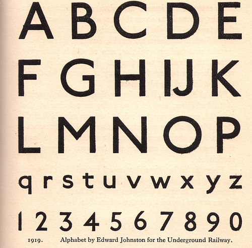
EDWARD JOHNSTON:
Edward Johnston, CBE (11 February 1872 – 26 November 1944) was a British craftsman who is regarded, with Rudolf Koch, as the a father of modern calligraphy, in the form of the broad edged pen as a writing tool, a particular form of calligraphy.
Johnston was born in San José, Uruguay. He started teaching at the Central School of Arts and Crafts in London's Southampton Row, where he influenced the typeface designer and sculptor Eric Gill. Then he moved on to the Royal College of Art and many students were inspired by his teachings. In 1912 Johnston followed Gill to Ditchling where he died in 1944.
He is most famous for designing the sans-serif Johnston typeface that was used throughout the London Underground system until it was re-designed in the 1980s. He also redesigned the famous roundel symbol used throughout the system.
He has also been credited for reviving the art of modern penmanship and lettering single-handedly through his books and teachings. Johnston also devised the simply crafted round calligraphic handwriting style, written with a broad pen, known as the foundational hand.
In 1921, students of Johnston founded the Society of Scribes & Illuminators (SSI), probably the world's foremost calligraphy society.
http://en.wikipedia.org/wiki/Edward_Johnston
BASKERVILLE:
Baskerville is a transitional serif typeface designed in 1757 by John Baskerville (1706–1775) in Birmingham, England. Baskerville is classified as a transitional typeface, positioned between the old style typefaces of William Caslon, and the modern styles of Giambattista Bodoni and Firmin Didot.
The Baskerville typeface is the result of John Baskerville's intent to improve upon the types of William Caslon. He increased the contrast between thick and thin strokes, making the serifs sharper and more tapered, and shifted the axis of rounded letters to a more vertical position. The curved strokes are more circular in shape, and the characters became more regular. These changes created a greater consistency in size and form.
Baskerville's typeface was the culmination of a larger series of experiments to improve legibility which also included paper making and ink manufacturing. The result was a typeface that reflected Baskerville's ideals of perfection, where he chose simplicity and quiet refinement. His background as a writing master is evident in the distinctive swash tail on the uppercase Q and in the cursive serifs in the Baskerville Italic. The refined feeling of the typeface makes it an excellent choice to convey dignity and tradition.
In 1757, Baskerville published his first work, a collection of Virgil, which was followed by some fifty other classics. In 1758, he was appointed printer to the Cambridge University Press. It was there in 1763 that he published his master work, a folio Bible, which was printed using his own typeface, ink, and paper.http://en.wikipedia.org/wiki/Baskerville
MEDIA SPECIFICITY:
RICHARD ECKERSLEY:
Richard Hilton Eckersley (20 February 1941–17 April 2006) was a graphic designer best known for experimental computerized typography designed to complement deconstructionist academic works.
Born in Lancashire, England, his father Tom Eckersley was a noted poster designer during and after the Second World War, later to become head of the School of Art and Design at the London College of Printing in the 1960s. After attending Trinity College in Dublin, Eckersley began his design career at Lund Humphries, the publisher of Typographica andThe Penrose Annual, where E. McKnight Kauffer had once been art director. http://en.wikipedia.org/wiki/Richard_Eckersley_(designer)
http://www.guardian.co.uk/news/2006/may/02/guardianobituaries.booksobituaries
WALTON CREEL:
Walton Hardy Creel (born November 12, 1974), also known as Walt Creel, is an American artist who lives and works in Birmingham, Alabama. Creel is best known for his series Deweaponizing the Gun, which focuses on firearms.


.jpg)