HUE:
Hue refers to a specific tone of colour. It is not another name for colour as colour can have saturation and brightness as well as a hue.

SATURATION:
Saturation refers to the purity, or intensity of a colour. It is the intensity of a hue from grey. At maximum saturation a colour would contain no grey at all. At minimum saturation, a colour would contain mostly grey.

BRIGHTNESS:
Brightness refers to how much white, or black, is contained within a colour.

The illustration above shows the difference between saturation and brightness. We first pick a hue from the colour wheel and then reduce the saturation so that the colour becomes more and more grey. Then picking a lesser saturated tone, you can see that by adding white or black, the brightness of the hue is affected. An important thing to notice is that increasing brightness is not the same as decreasing saturation. Decreasing saturation turns the colours into shades of grey, increasing brightness turns the hue lighter but without making it grey. This can be seen more clearly when the same theory is applied to a photograph.

HUE:
Hue defines pure color in terms of "red", "green" or "magenta". Hue also defines mixtures of two pure colours like "red-yellow" (~ "orange"), or "yellow-green" (limitations to this statement will be addressed later).
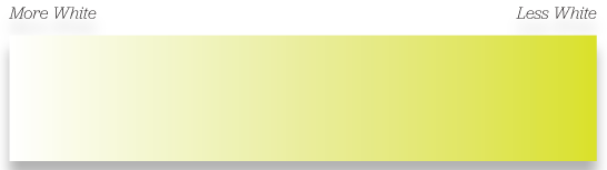
TINT:
Tint is a color term commonly used by painters.
A tint is a mixing result of an original color to which has been added white.
If you tinted a color, you've been adding white to the original colour.
A tint is lighter than the original colour.
When used as a dimension of a colour space, tint can be the amount of white added to an original color. In such a color space a pure color would be non-tinted.
SHADE:
Shade is a color term commonly used by painters.
A shade is a mixing result of an original color to which has been added black.
If you shaded a color, you've been adding black to the original colour.
A shade is darker than the original colour.
When used as a dimension of a colour space, shade can be the amount of black added to an original color. In such a color space a pure colour would be non-shaded.
TONE:
Tone is a color term commonly used by painters.
There is a broader and a narrower definition of tone.
The broader definition defines tone as a result of mixing a pure color with any neutral/grayscale color including the two extremes white and black. By this definition all tints and shades are also considered to be tones.
The narrower definition defines tone as a result of mixing a pure color with any grayscale color excluding white and black. By this definition a certain amount of white and black must have been added to the original color. Furthermore the following is true: If you changed the tonal value of a color, you've been adding gray (any ratio of mixture) to the original color.
A tone is softer than the original colour.
Tone is not used as a dimension of a colour space. Instead, the tonal difference consists of the amounts of white and/or black used to determine a certain colour.
Exception:
A result of mixing an original color with a [hue]scale color (e.g. brownscale/sepia).
SATURATION:
Saturation is a color term commonly used by (digital/analog) imaging experts.
Saturation is usually one property of three when used to determine a certain color and measured as percentage value.
Saturation is usually one property of three when used to determine a certain color and measured as percentage value.
Saturation defines a range from pure color (100%) to gray(0%) at a constant lightness level. A pure color is fully saturated.
From a perceptional point of view saturation influences the grade of purity or vividness of a color/image. A desaturated image is said to be dull, less colorful or washed out but can also make the impression of being softer.
We will clear up the term saturation from a color mixing point of view in the colour spaces section.
http://www.workwithcolor.com/color-properties-definitions-0101.htm
No comments:
Post a Comment